
Designing the Future of Fintech:
Chargily’s Bold New Vision
Chargily is one of Algeria’s leading fintech innovators, shaping the future of digital payments through secure, accessible, and modern financial solutions. As the company grew and its services expanded across the digital ecosystem, the need for a renewed and unified brand identity became clear. Many users perceived Chargily only as a payment gateway, while its mission encompasses a broader vision of simplifying transactions, empowering businesses, and driving financial inclusion nationwide. The challenge was to modernize the brand, strengthen user adoption, and express Chargily’s true role within Algeria’s evolving digital economy.
As the designer and artistic director of this rebranding project, I led the full strategic and creative process, including research, competitive analysis, conceptual development, and visual exploration. The core concept
I crafted is built around ideas of fluidity, trust, accessibility, and innovation, reflecting the brand’s promise of seamless multi-transaction experiences. Modernity, clarity, security, and technological advancement served as guiding principles to shape an identity that feels intuitive, reliable, and future-oriented.
I crafted is built around ideas of fluidity, trust, accessibility, and innovation, reflecting the brand’s promise of seamless multi-transaction experiences. Modernity, clarity, security, and technological advancement served as guiding principles to shape an identity that feels intuitive, reliable, and future-oriented.
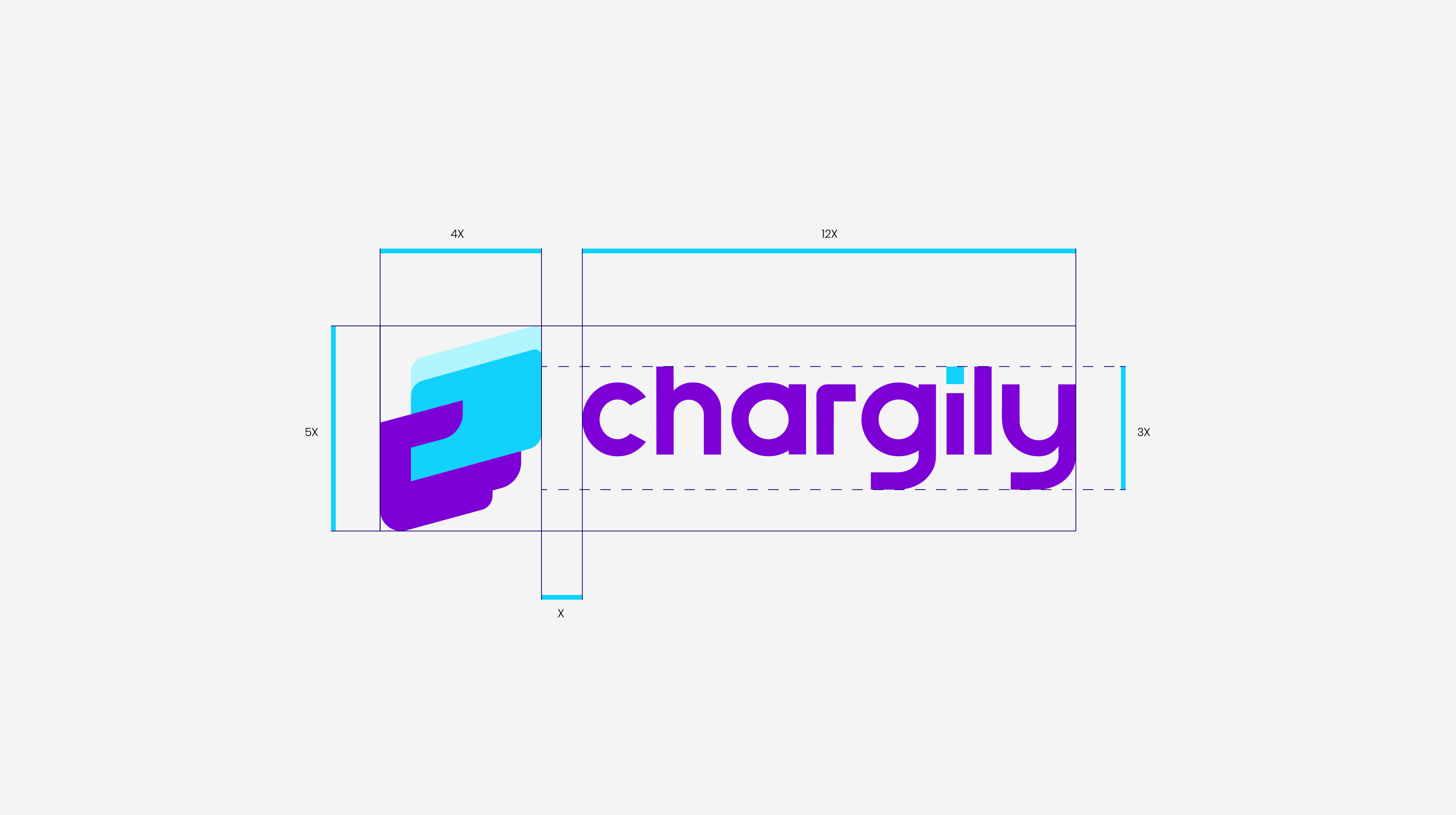
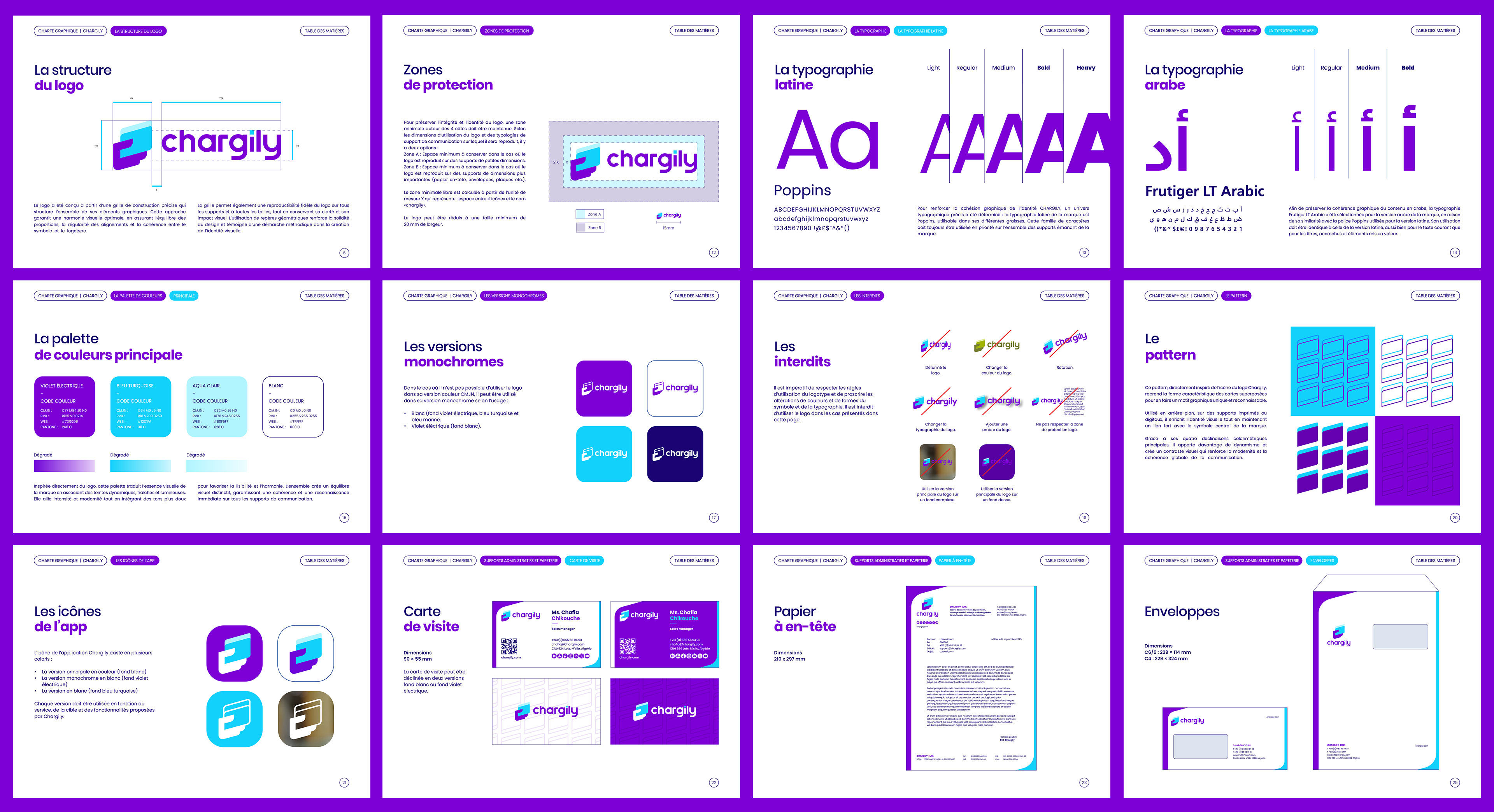
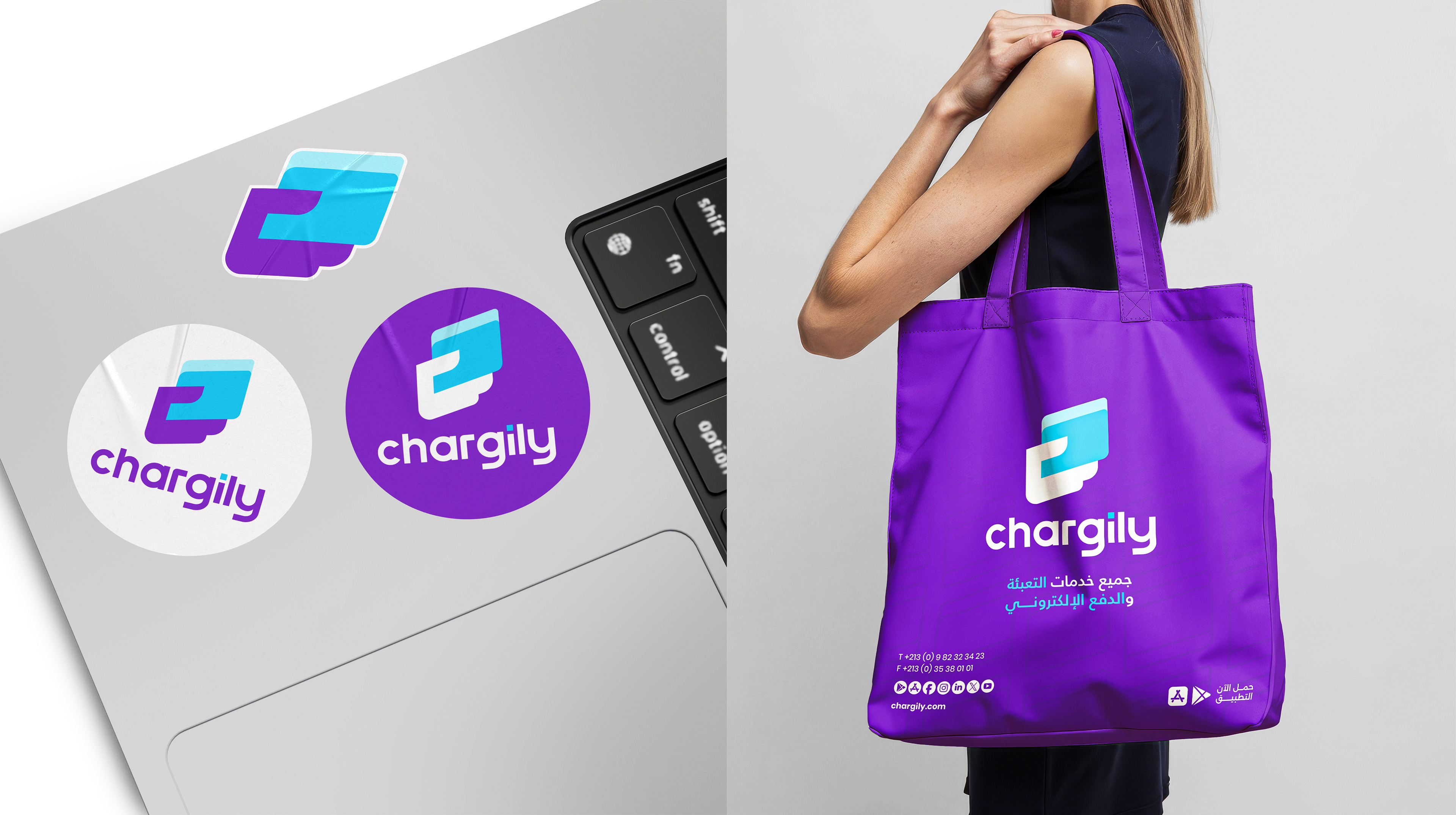
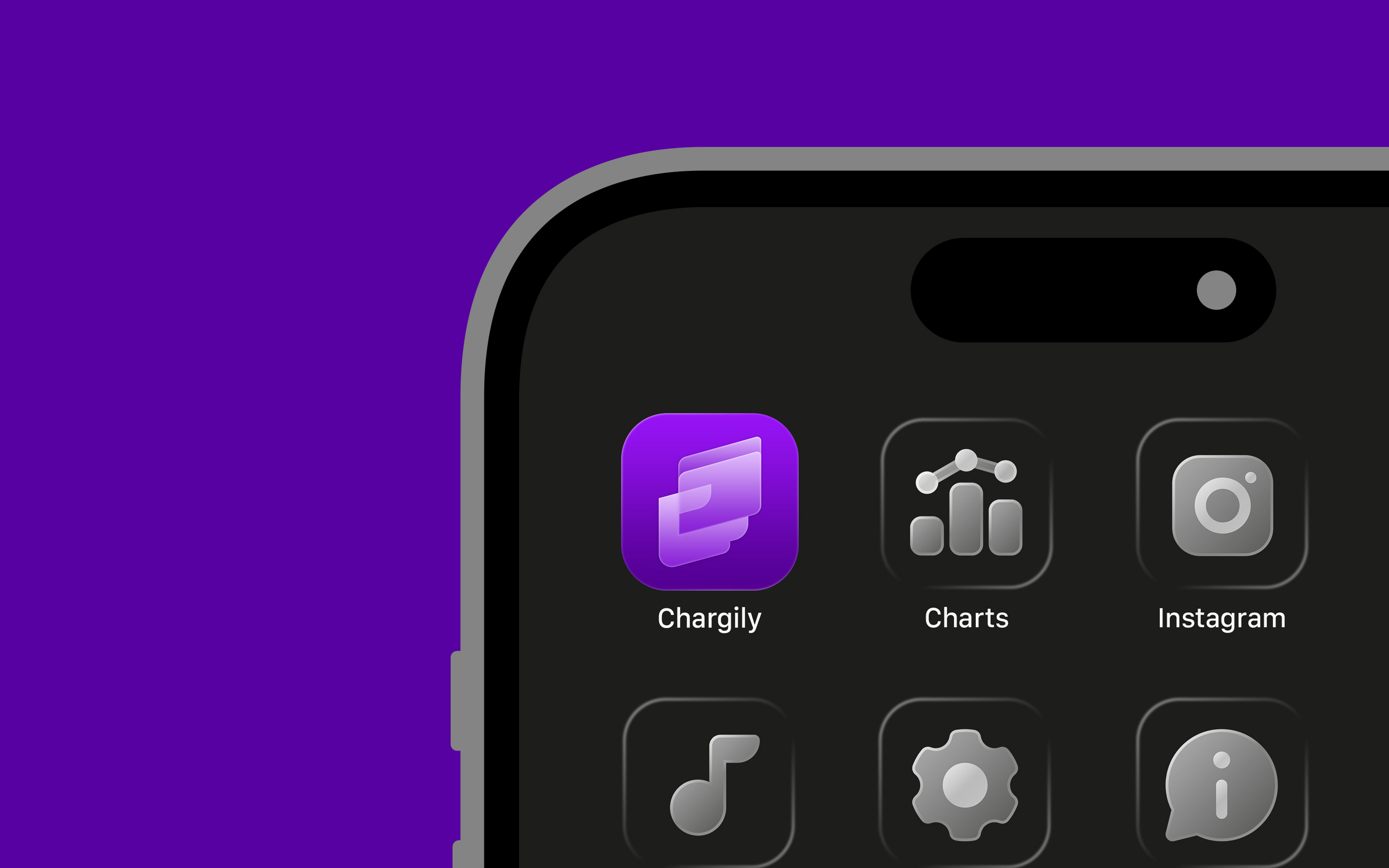
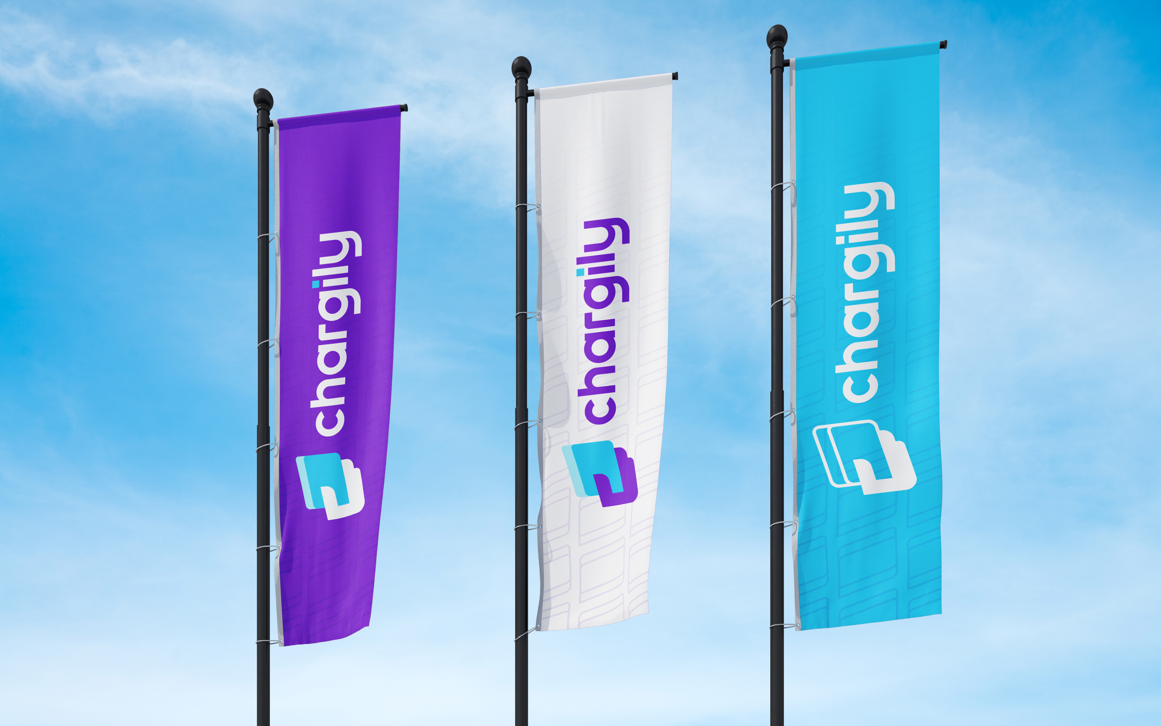
To bring this vision to life, I developed a complete visual ecosystem: a redesigned logo, a refined color palette,
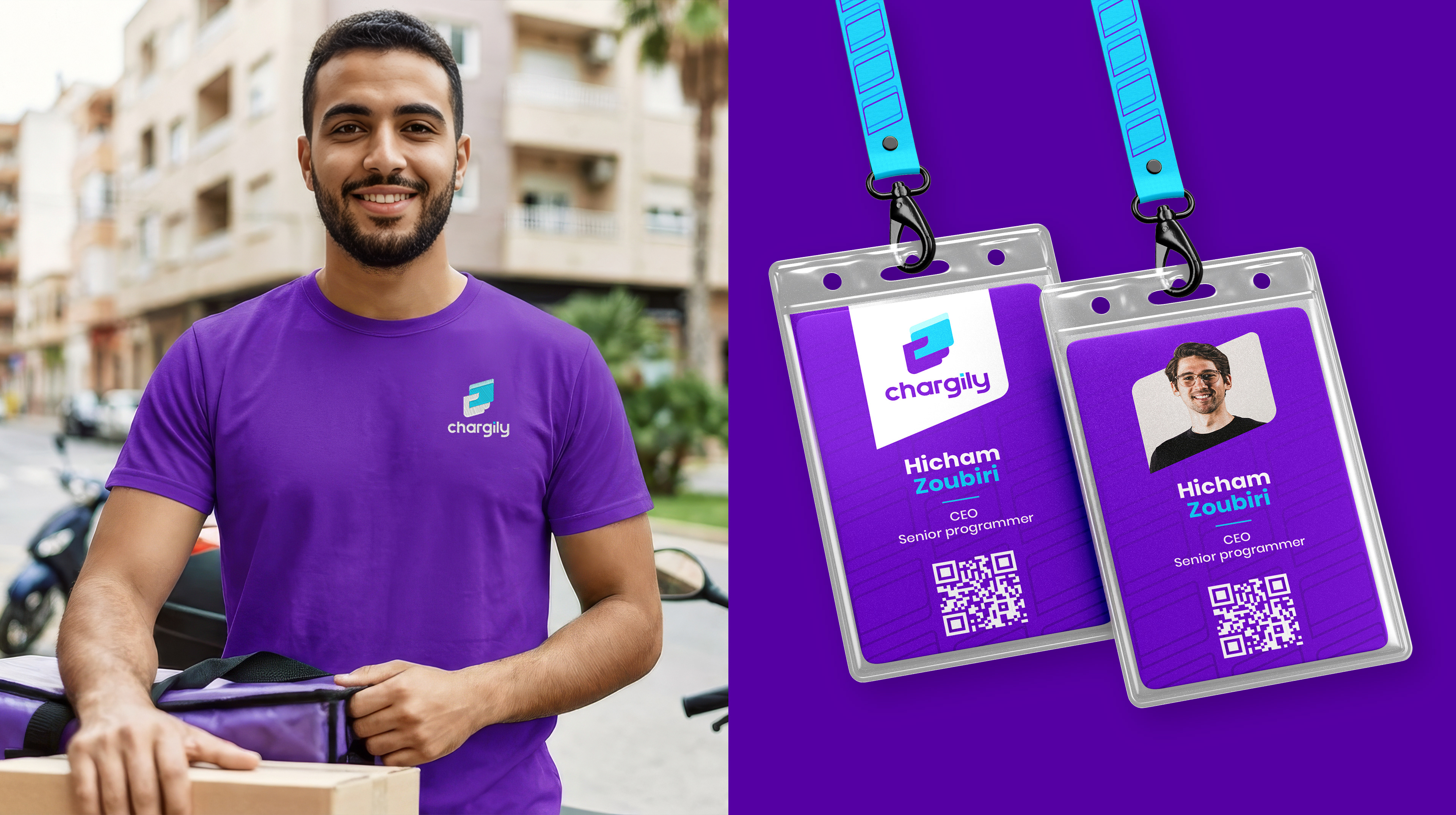
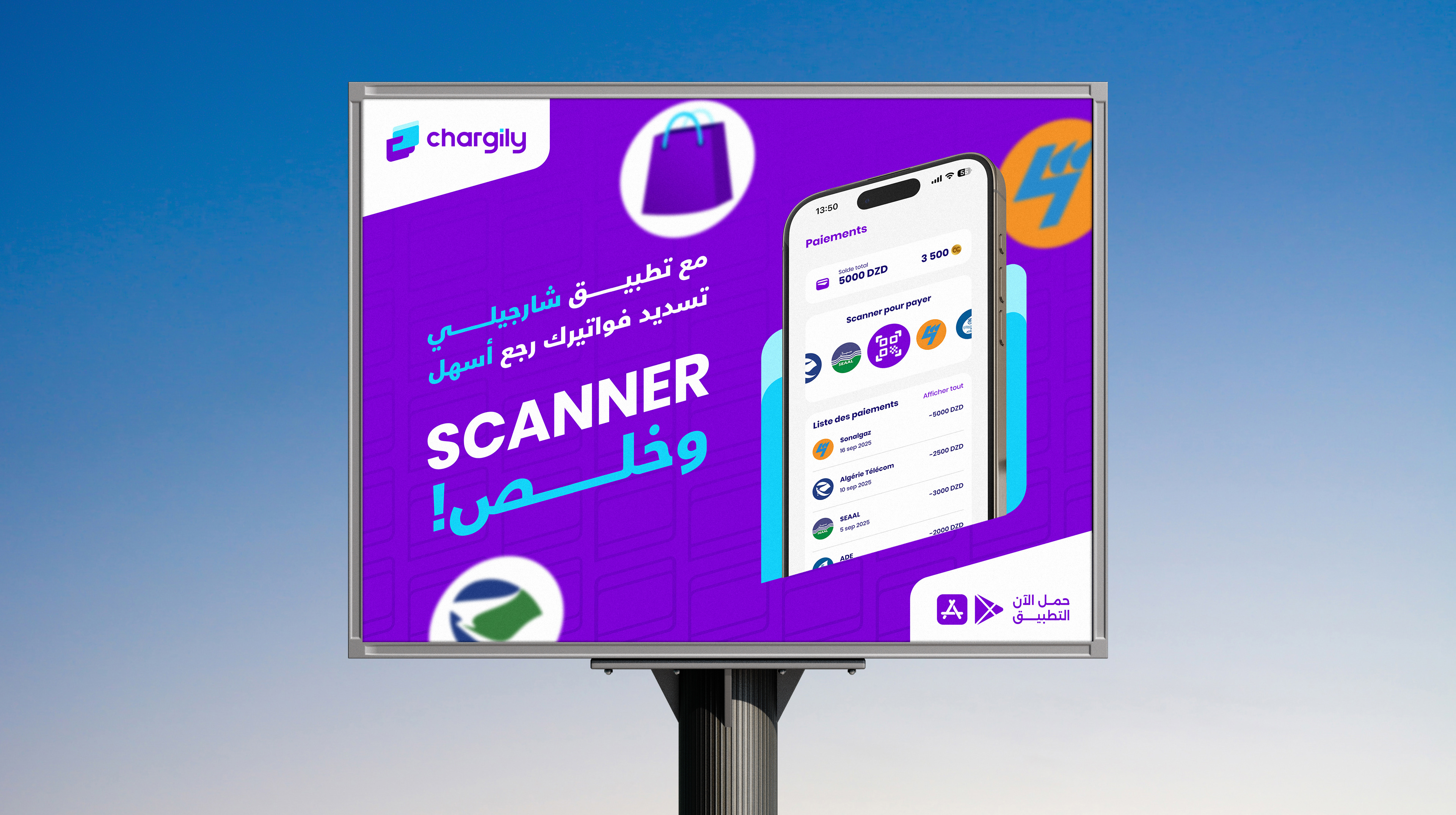
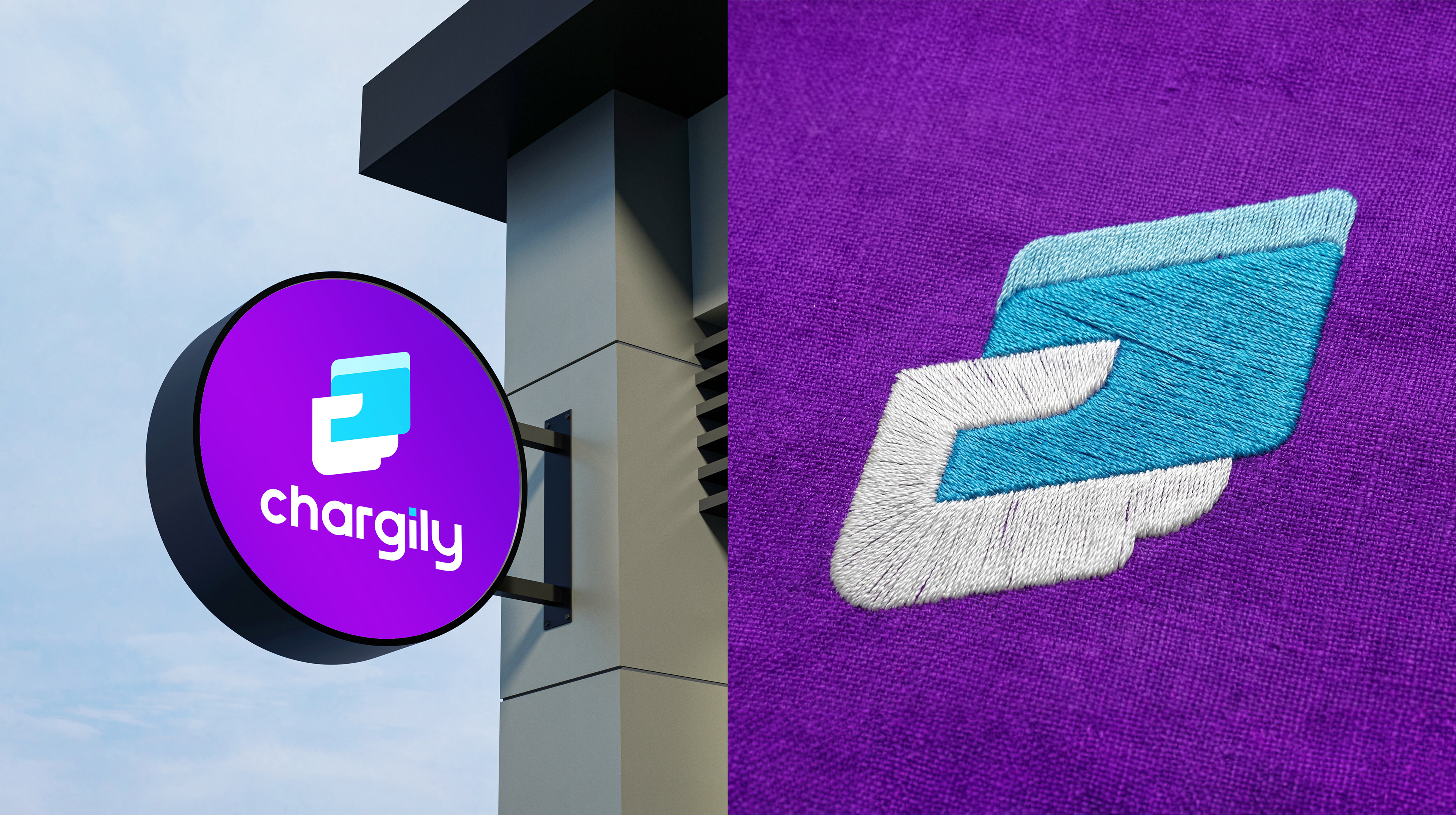
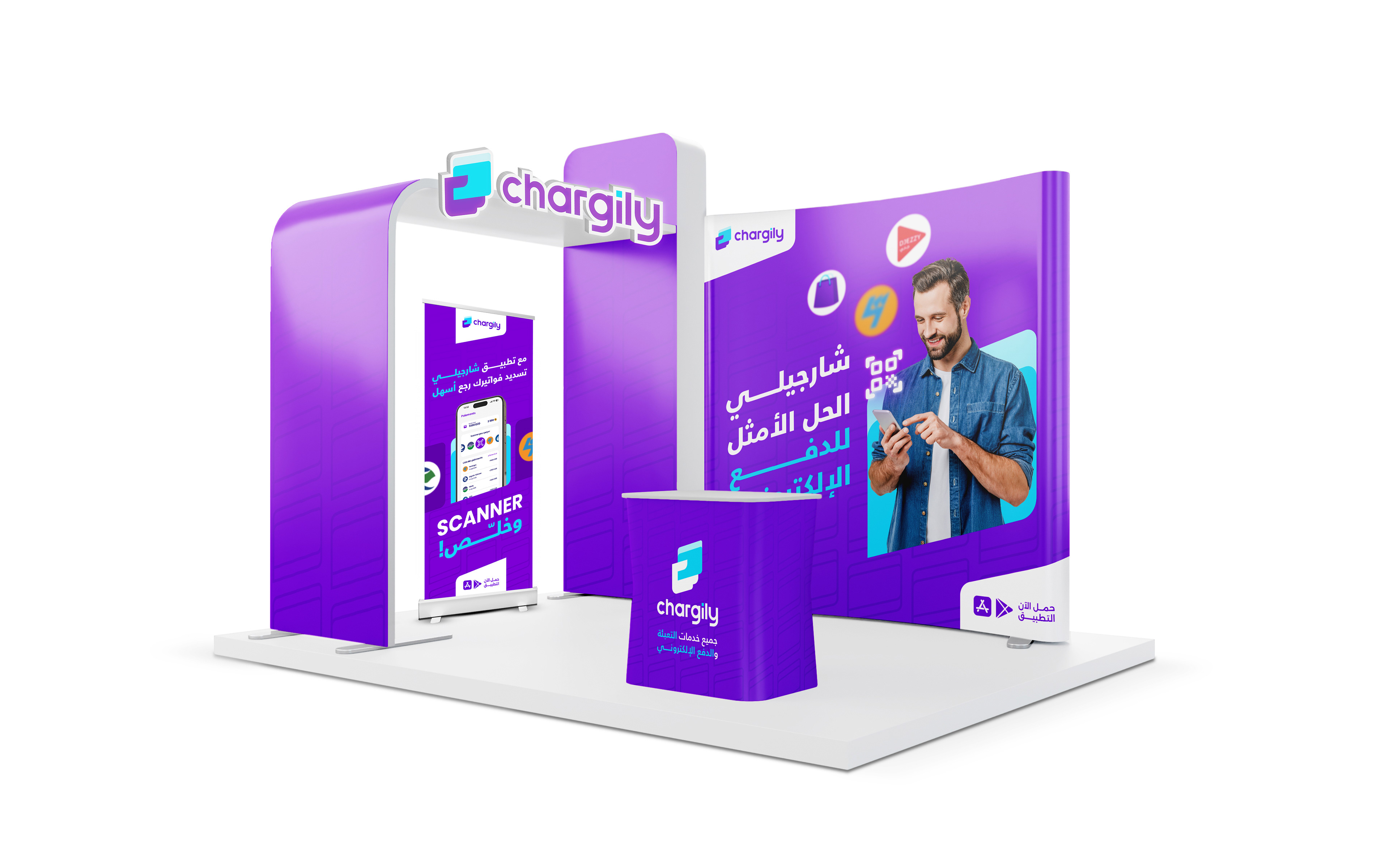
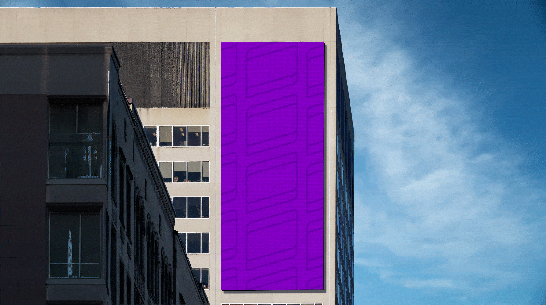
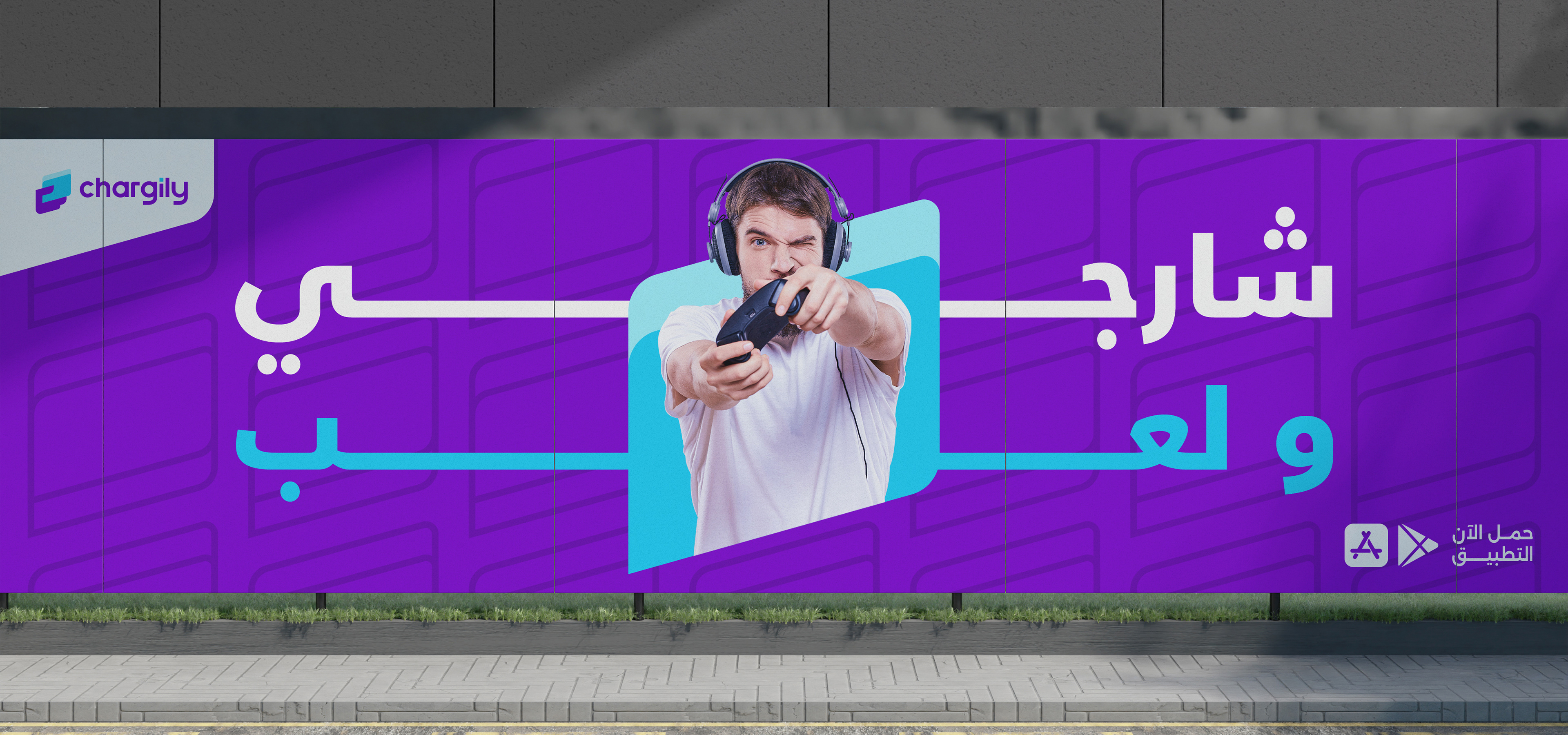
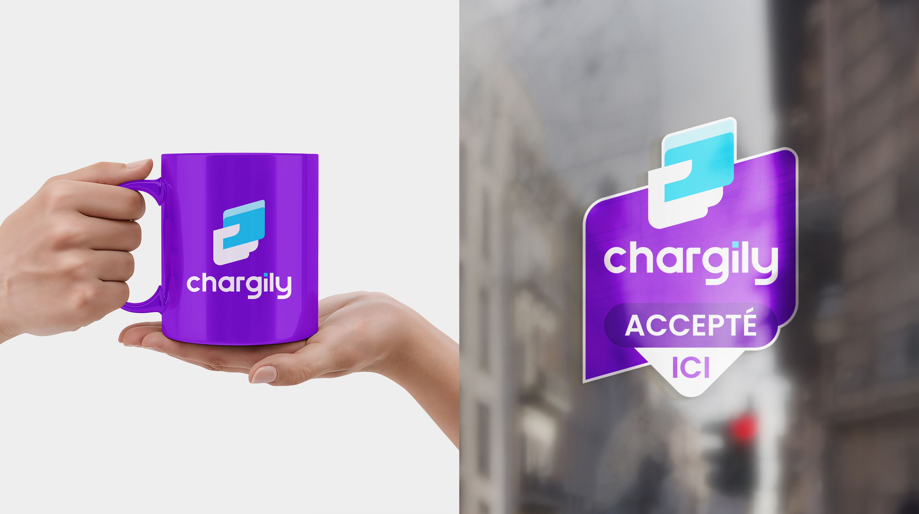
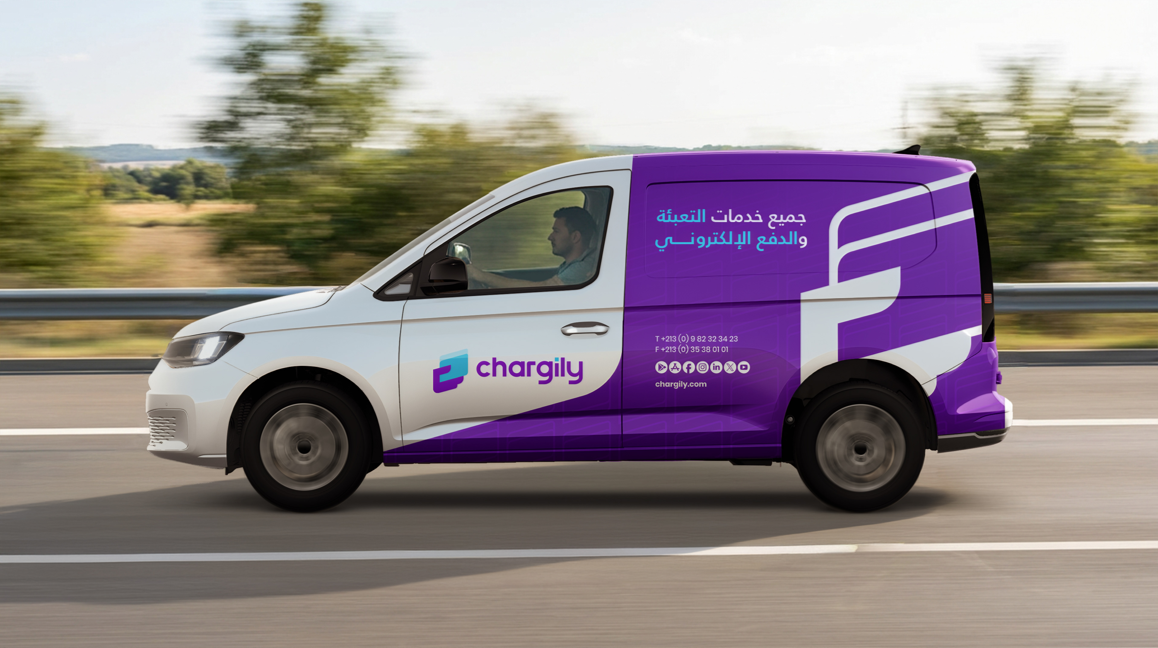
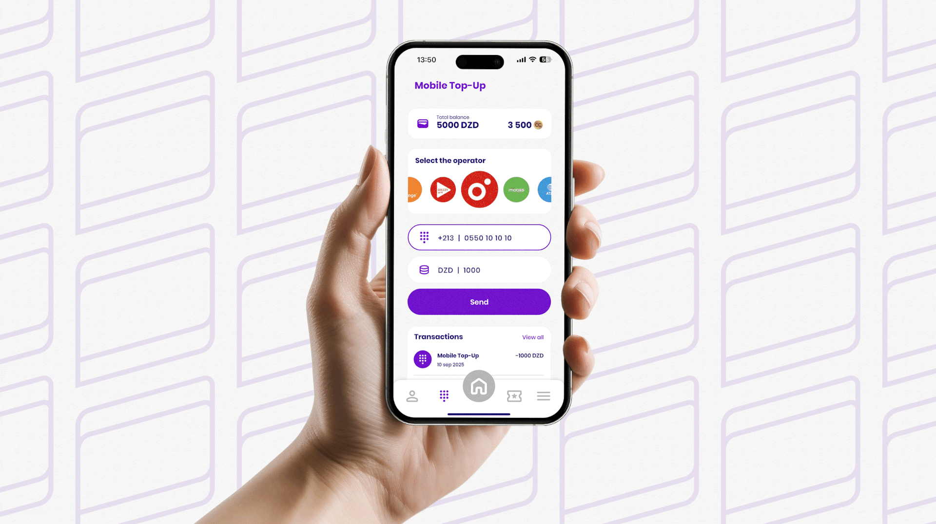
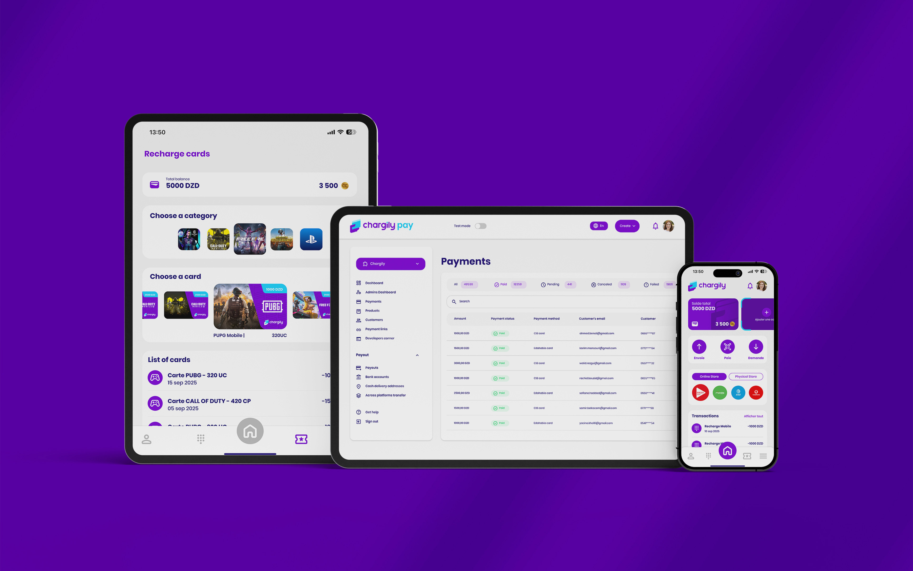
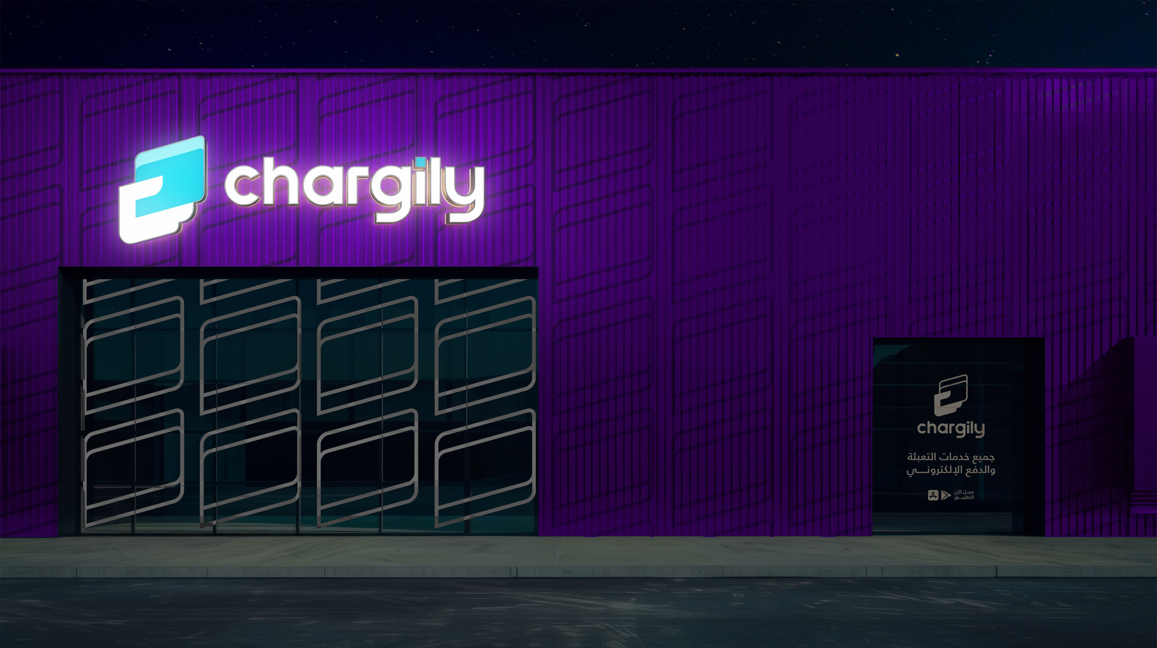
a clean and contemporary typographic system, and a set of dynamic patterns embodying movement and digital connectivity. These elements extend cohesively across all touchpoints, from marketing and advertising materials to digital interfaces, signage, and physical supports. The result is a transformed brand image that enhances user experience, strengthens trust, and positions Chargily as a forward-thinking fintech leader equipped to meet the demands of a rapidly evolving digital landscape.
a clean and contemporary typographic system, and a set of dynamic patterns embodying movement and digital connectivity. These elements extend cohesively across all touchpoints, from marketing and advertising materials to digital interfaces, signage, and physical supports. The result is a transformed brand image that enhances user experience, strengthens trust, and positions Chargily as a forward-thinking fintech leader equipped to meet the demands of a rapidly evolving digital landscape.
Client: Chargily
Creative Director: Sidahmed Badredine
Agency: SABD Agency
Year: 2025
Creative Director: Sidahmed Badredine
Agency: SABD Agency
Year: 2025

In this project for Chargily, I led the strategic rebranding process with the goal of elevating
the company's identity from a traditional service provider to a modern Fintech leader.
My role began with an in-depth analysis of the local and international competitive landscape, including benchmarking industry giants such as Stripe and Revolut, to define a new visual direction.
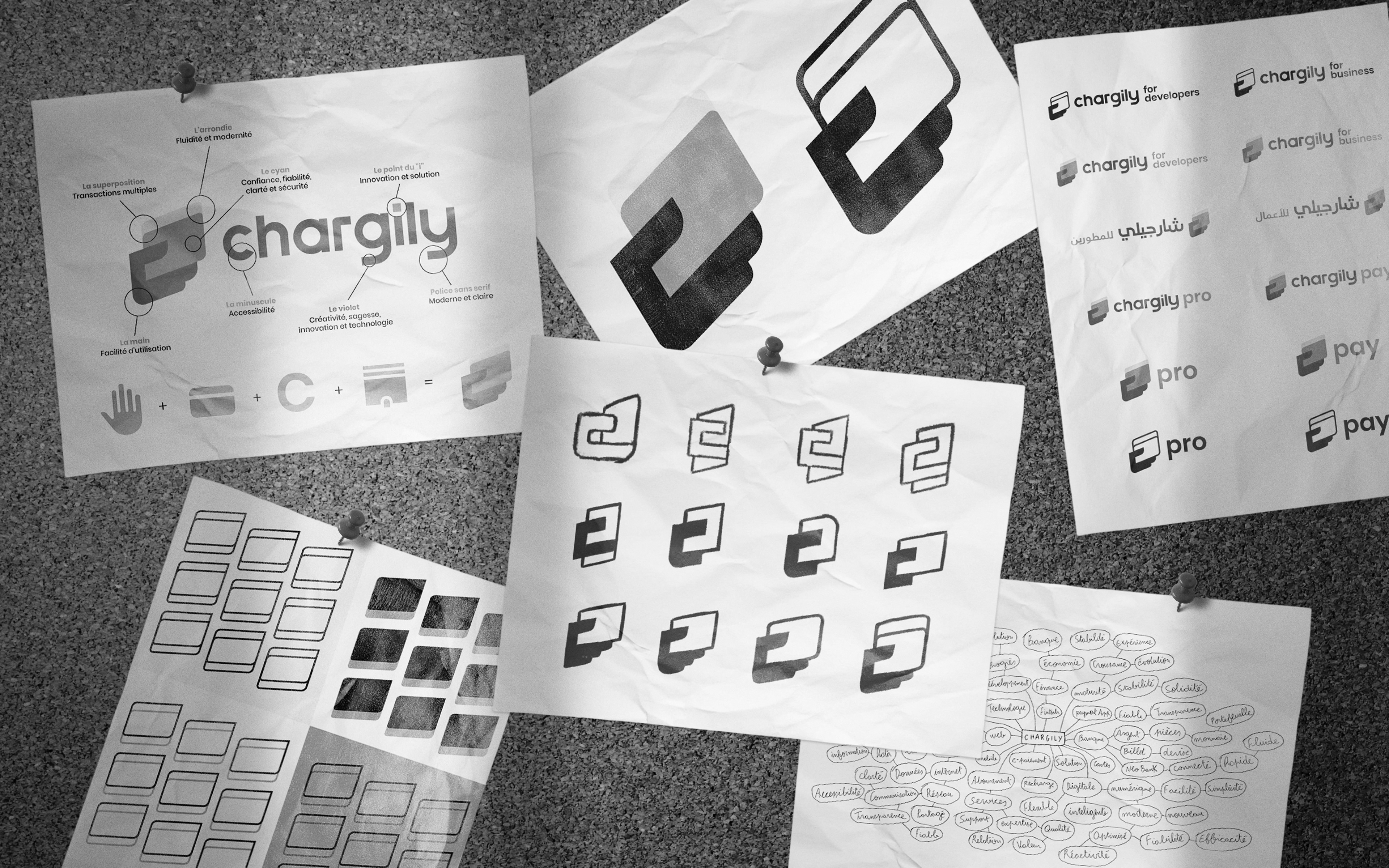
I established that the previous identity, with its obsolete smartphone icon and handwritten typography, no longer reflected the company's growth or its positioning in the financial sector.
the company's identity from a traditional service provider to a modern Fintech leader.
My role began with an in-depth analysis of the local and international competitive landscape, including benchmarking industry giants such as Stripe and Revolut, to define a new visual direction.
I established that the previous identity, with its obsolete smartphone icon and handwritten typography, no longer reflected the company's growth or its positioning in the financial sector.
This research phase led to the definition of the new visual orientation, which was centered on core values like reliability, fluidity, and accessibility. I then directed the brainstorming and mind-mapping process to extract fundamental concepts (wallet, card, connection, growth).
Based on this, I developed three distinct conceptual routes, focusing in turn on the digital wallet metaphor, the symbolism of growth using an arrow, and the stability of transactions using a square form.
Based on this, I developed three distinct conceptual routes, focusing in turn on the digital wallet metaphor, the symbolism of growth using an arrow, and the stability of transactions using a square form.
I executed these concepts by creating a complete, vector-based visual identity system.
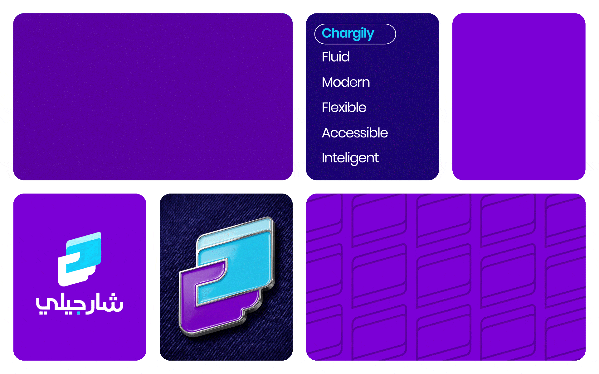
I selected a geometric sans-serif typeface for added professionalism and developed a strategic color palette, utilizing deep blues and violets to inspire confidence and technology.
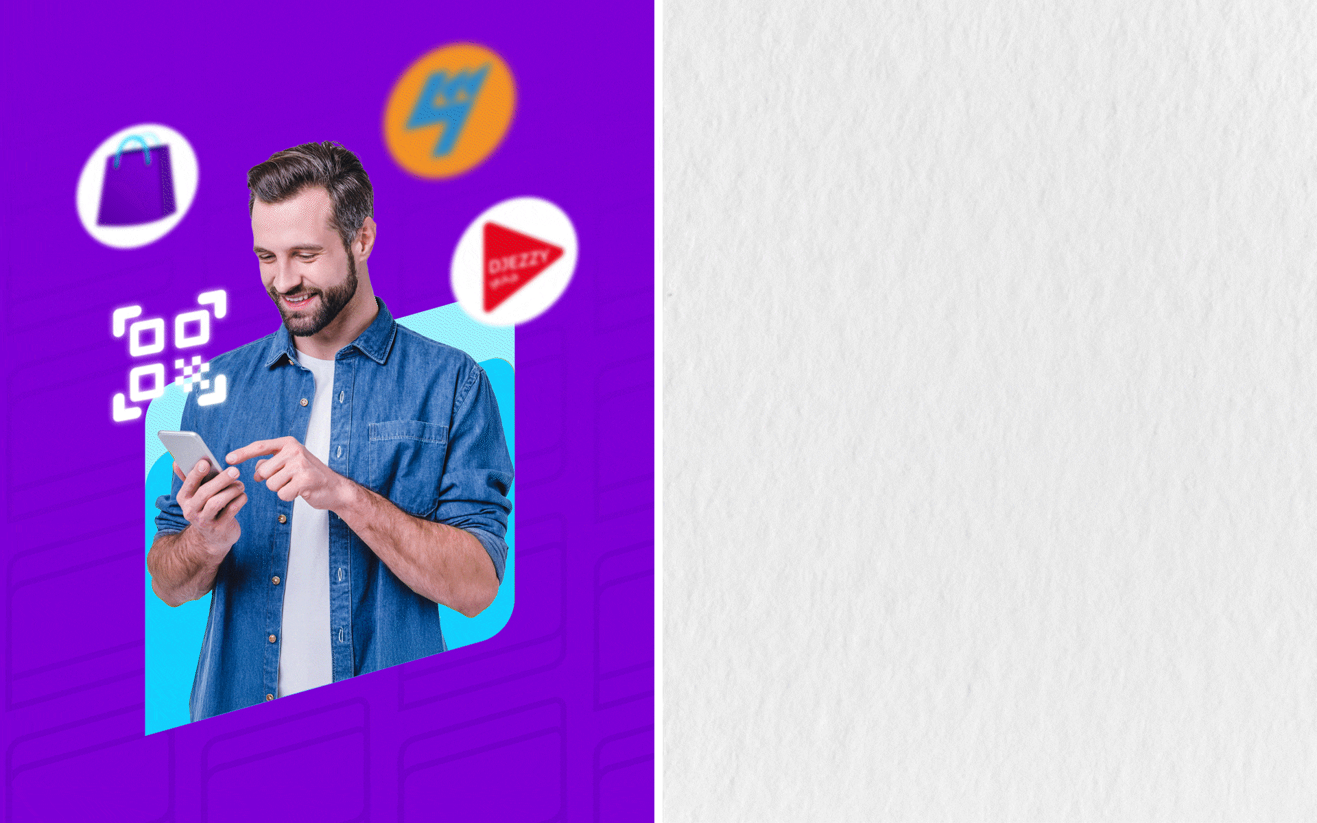
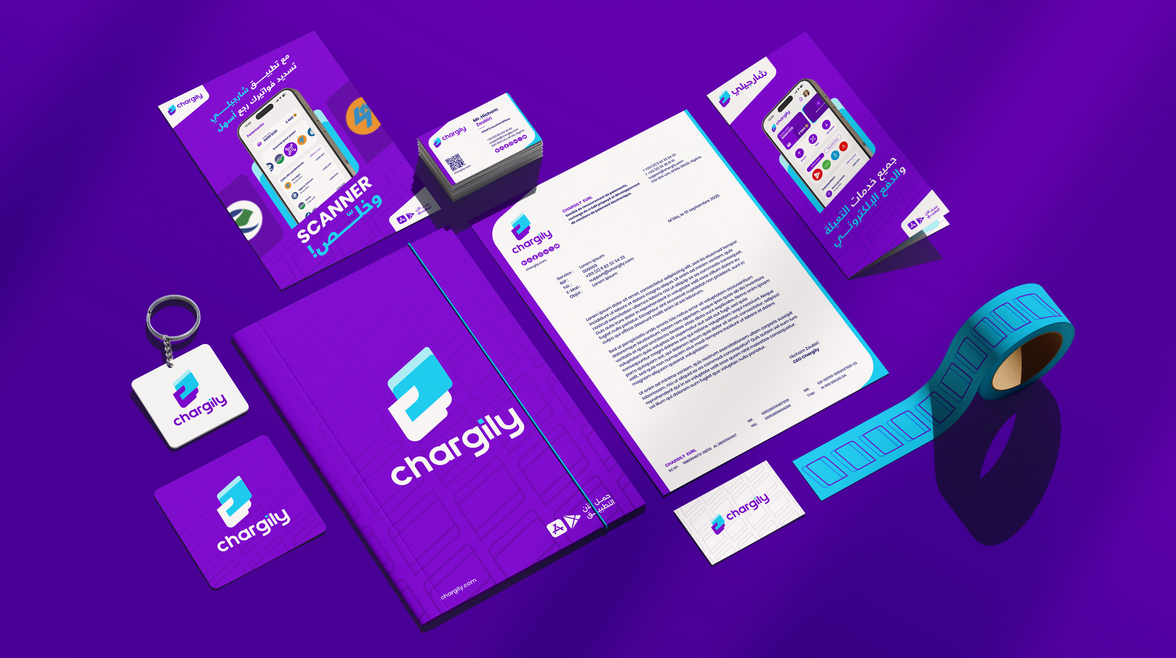
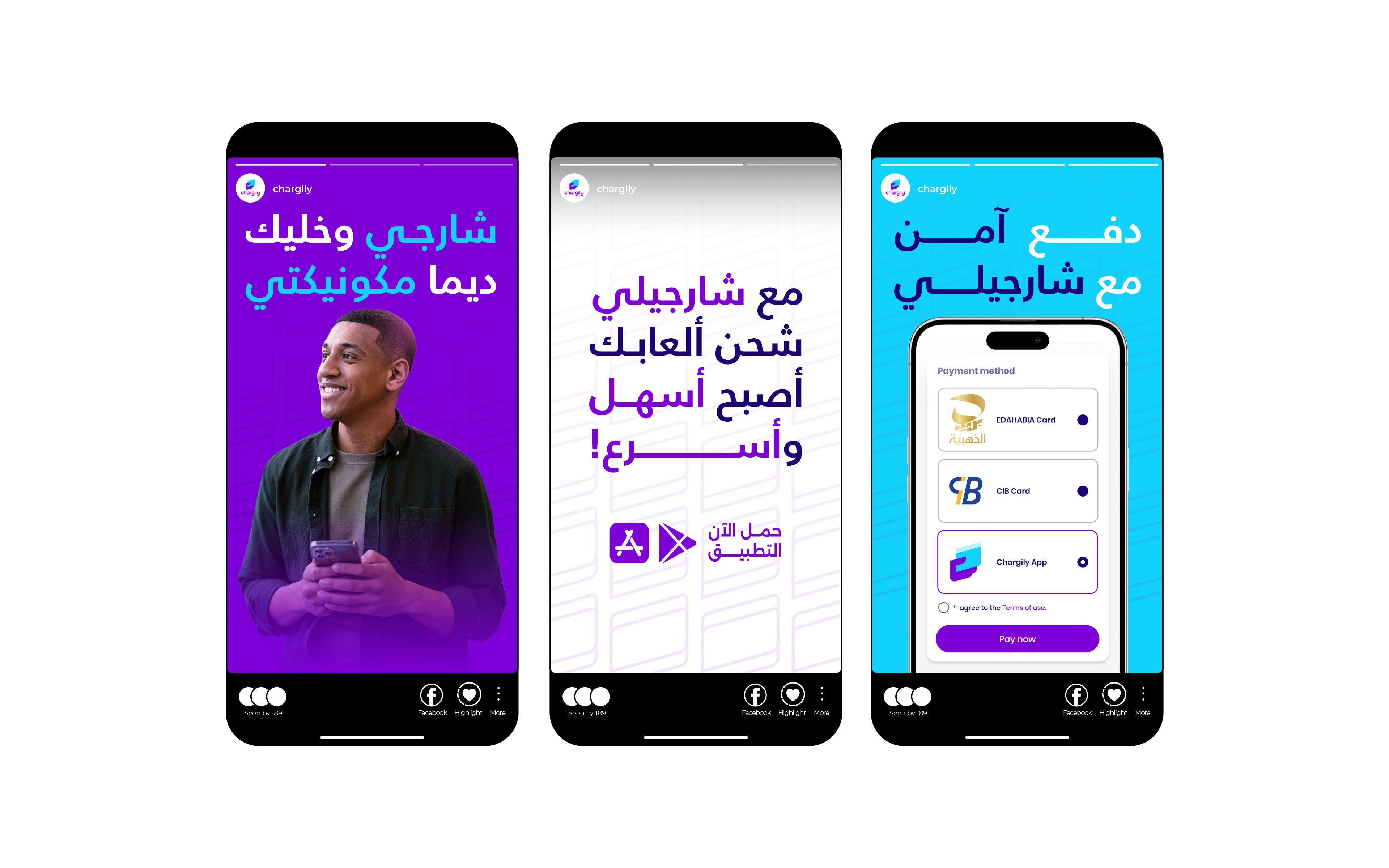
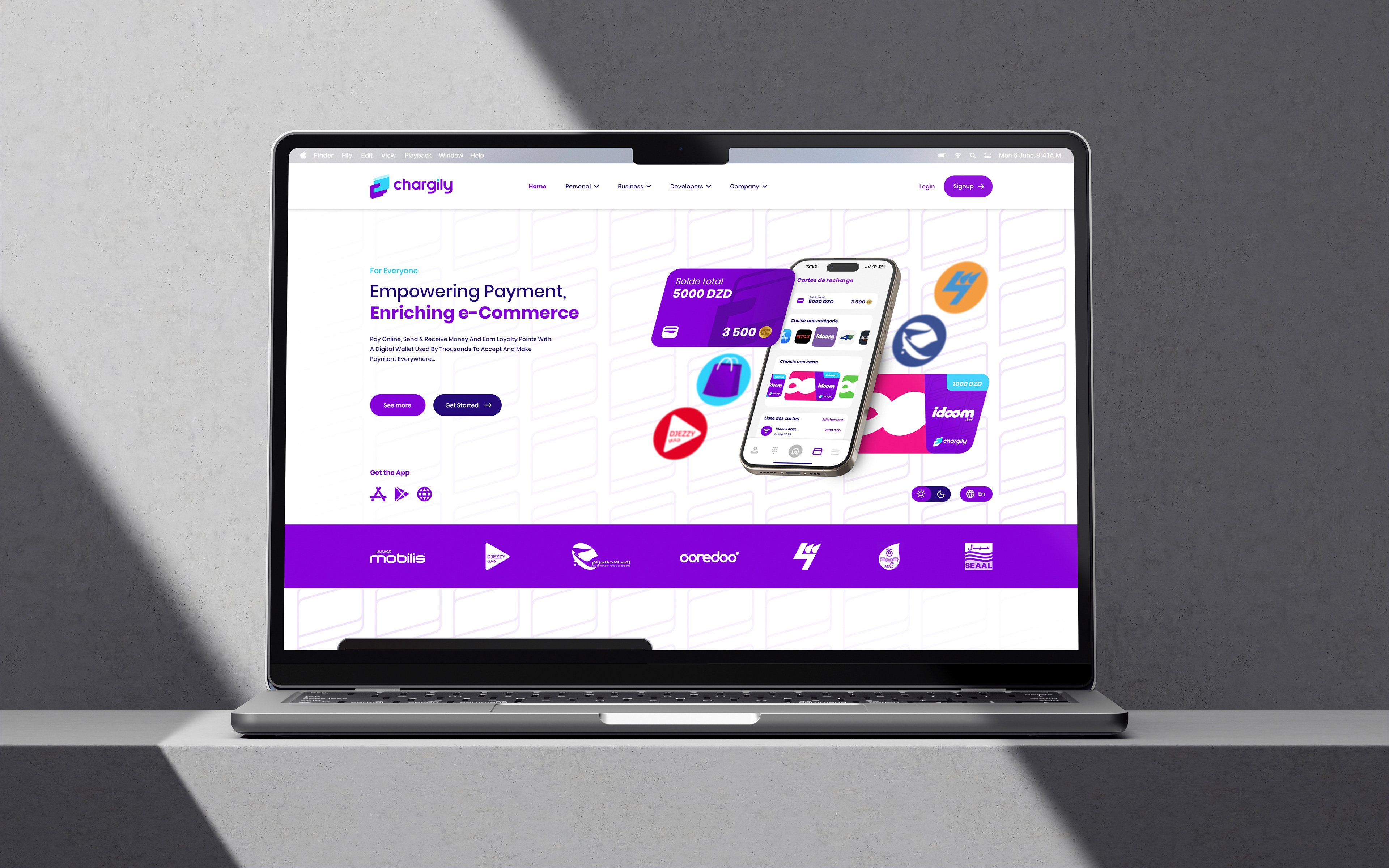
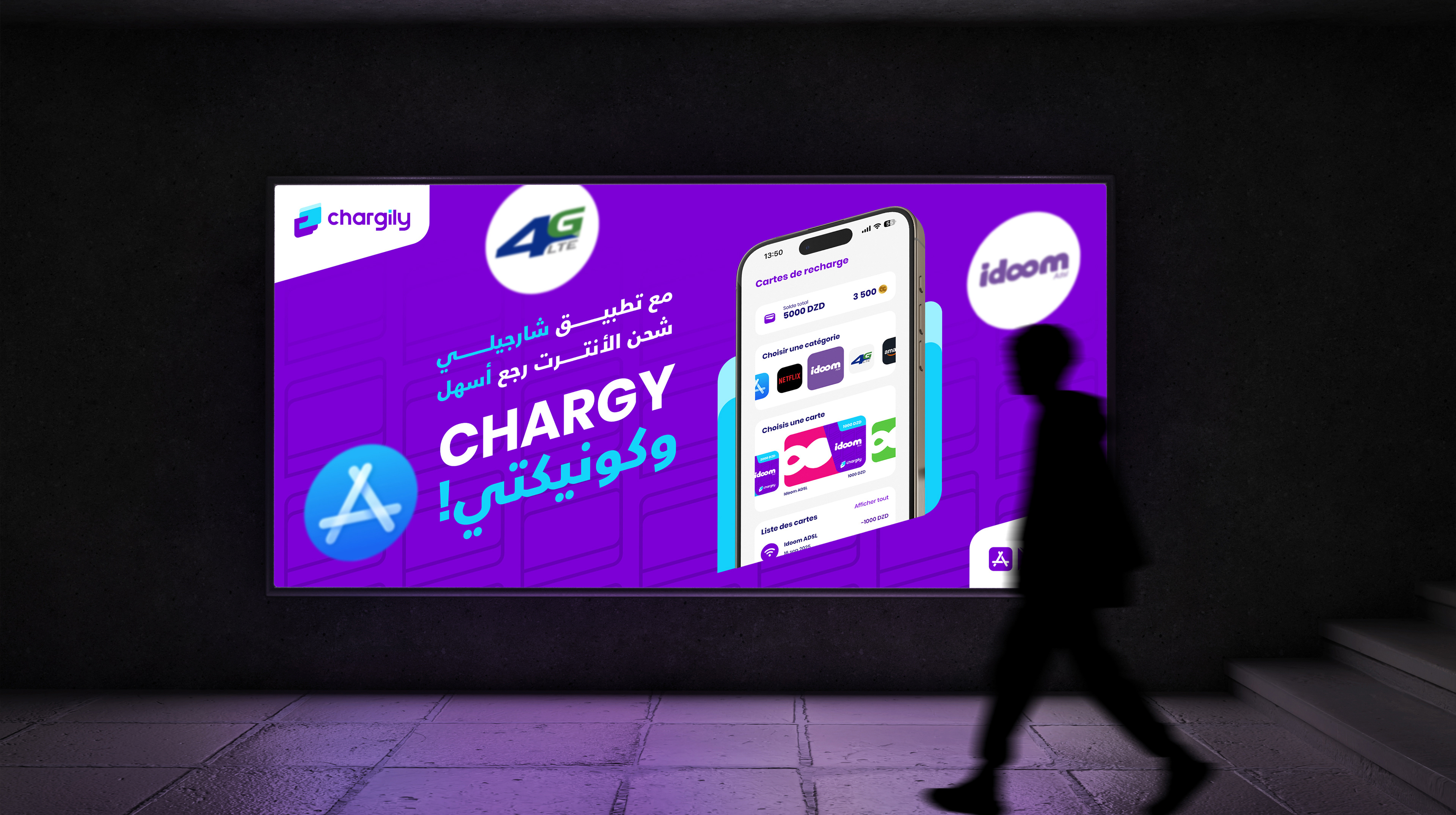
Finally, I ensured the brand's real-world context through detailed simulations (mockups) to guarantee that the new identity is coherent, versatile, and effective across all digital and physical touchpoints, including both French and Arabic linguistic contexts.
I selected a geometric sans-serif typeface for added professionalism and developed a strategic color palette, utilizing deep blues and violets to inspire confidence and technology.
Finally, I ensured the brand's real-world context through detailed simulations (mockups) to guarantee that the new identity is coherent, versatile, and effective across all digital and physical touchpoints, including both French and Arabic linguistic contexts.
Thank You !
Want us to help you build brand
recognition for your business,
reach us at:
Email: sabdstudio@gmail.com
Behance: be.net/sabdagency
Instagram: instagram.com/sabdagency